

I’ve worked with Toscana Restaurant Group for years, so when they brought me on to help create ALL ROADS, I knew it would be something special. This wasn’t about another traditional Italian place—there’s no pasta here. Instead, the menu is distinctly Roman. The challenge was to build a brand that felt timeless, modern, and just a bit whimsical. Anchored around pinsa, a dish with a recipe that dates back to ancient Rome, the branding had to reflect that subtle history without falling into tired clichés.
We didn’t want the identity to lean on anything overtly “Roman”—the goal was to blend old-world tradition with the polished yet easygoing vibe of Brentwood. From the start, it was clear that ALL ROADS had to feel authentic and sophisticated, while also lighthearted and welcoming. It needed to stand out without trying too hard, and evoke a dining experience that’s as rooted in history as it is in L.A.'s modern culture. The result is a place where Roman tradition meets California cool, offering a fresh, distinctly Roman take on the local dining scene.
BRAND STRATEGY / NAMING / VISUAL IDENTITYMESSAGING / eNVIRONMENTAL BRANDING / PACKAGING DESIGN


THE APPROACH
The name ALL ROADS wasn’t just a play on the classic “all roads lead to Rome”—it was a strategic choice. We wanted something that felt welcoming and grounded in Roman heritage, while also hinting at a shared experience for everyone who walked through the door. The name reflects the restaurant’s blend of authenticity and inclusivity, emphasizing the idea that all paths converge here—whether it’s through the flavors of pinsa or a perfectly paired glass of wine. It’s about creating connections, just like the roads that once led to Rome.


THE MARKS
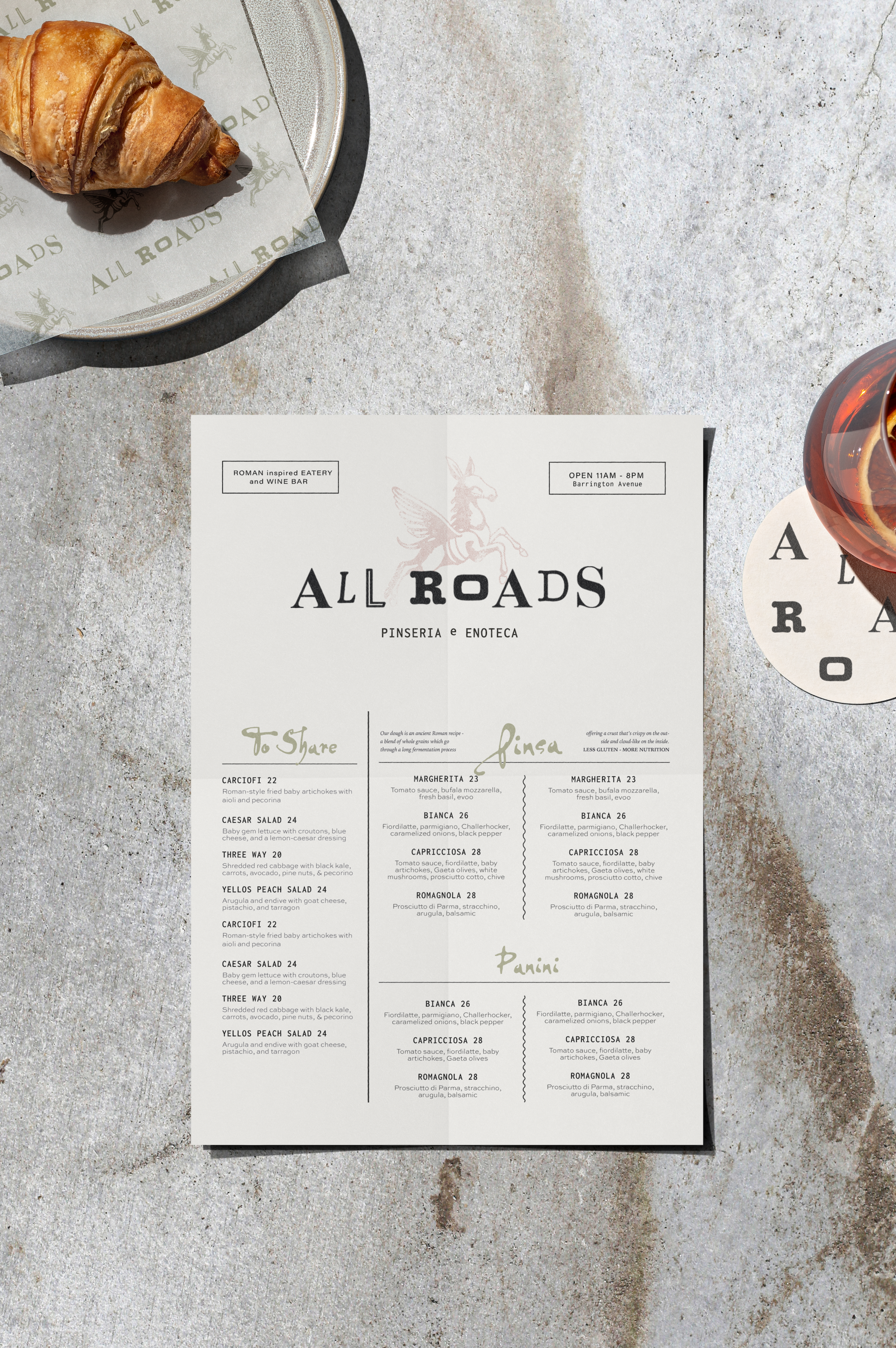
Central to the brand’s visual identity is the Flying Donkey, a fictional muse inspired by a funky little piece of Roman street art with an interesting story.
This whimsical yet powerful symbol was born out of the rebellious spirit of a nearly forgotten neighborhood and it's resilient people, where the emblem remains today as a testament to community, hope, and artistic expression.
The risograph effect used on the donkey combines the rough textures of ancient Roman frescoes with a bold, street-art aesthetic. This approach marries historical art techniques with modern, urban influences, giving the design a raw, layered feel that reflects both tradition and contemporary culture.
We also developed several supporting marks, including a bold design for the tagline "Inspired by Tradition, Not Bound by It," which reinforced the brand’s philosophy.
The address mark, featuring the shop’s contact information, became a versatile tool across various applications, seamlessly integrating practicality with the brand’s aesthetic. Together, these marks create a cohesive identity that reflects ALL ROADS’ unique character.

TYPOGRAPHY
We mixed contrasting fonts to create a visual collage that speaks to the dynamic blend of old and new, reinforcing our narrative of inclusivity and adventure.
This is most apparent in the wordmark, where contrasting font styles come together in a seamless collage, resulting in a logo that stands out and captures the essence of the brand.


CASE STUDY FOCUS
PACKAGING
Of course the packaging wasn’t left out of the story—it carries the brand’s narrative beyond the restaurant, so the ALL ROADS experience continues with every takeaway. And as a cherry on top, we extended the brand into the world of craft beer with August Notions, a sub-brand inspired by the Roman Stoics.
ENVIRONMENT
In collaboration with the architect and interior designer, I worked to ensure that the interior spaces reflected the brand’s ethos. The focal point of the space is a hand-painted wall featuring a fresco of our fictional muse, the Flying Donkey. This striking piece serves as both an artistic centerpiece and a narrative element that ties the brand’s story together. The overall result is an inviting and refined atmosphere where modern design meets classic Roman elements, creating a cohesive brand experience.
MESSAGING
Messaging was crafted to reflect a casual, warm sophistication—unpretentious yet refined, and a little quirky. Central to this was the creation of the tagline "Inspired by Tradition, Not Bound by It." This line, carried effortlessly by our Flying Donkey muse, speaks to the restaurant’s commitment to honoring Roman culinary traditions while embracing modern innovation.

THE OUTCOME
ALL ROADS Pinseria + Enoteca has quickly become a beloved spot in Brentwood, known for its authentic yet modern, subtly sexy take on Roman dining. Amidst Los Angeles's sea of over 500 Italian restaurants, ALL ROADS has distinguished itself by leaning into its Roman roots and developing a distinctive personality that blends tradition with a modern edge.
WHERE CREATIVITY &
STRATEGY COLLIDE
IF YOU’RE SEEKING A CREATIVE PARTNER TO GROW YOUR BRAND, OVERCOME CHALLENGES, OR EXPLORE NEW IDEAS——
i'M YOUR GIRL. LET’S COLLABORATE.
IF YOU’RE SEEKING A CREATIVE PARTNER TO GROW YOUR BRAND,
OVERCOME CHALLENGES, OR EXPLORE NEW IDEAS,
REACH OUT. LET’S COLLABORATE.