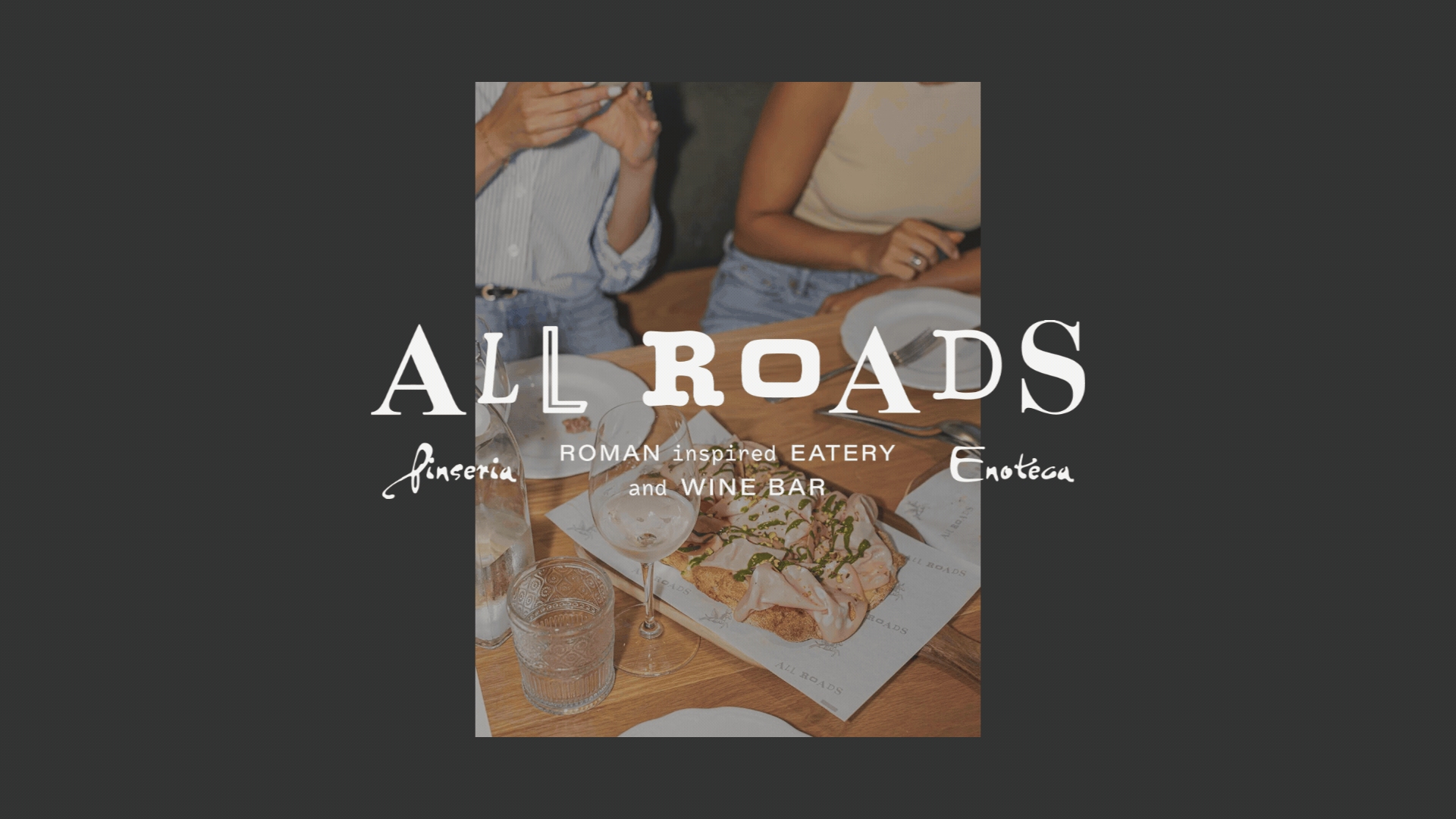
I’ve worked with Toscana Restaurant Group for years, so when they asked me to help shape their newest concept, I knew it would be something different. Not your typical trattoria—no pasta, no clichés. This one was Roman. Rooted in tradition but built to feel modern, effortless, and just a little unexpected.
At the heart of it: pinsa, an ancient Roman flatbread most Angelenos have never heard of. The challenge was clear—create a brand that felt timeless, a little sexy, and just strange enough to stand out from the 500+ Italian restaurants in LA.
We didn’t want to lean on the usual Roman shorthand. No columns, no togas. Instead, we let subtle cues do the work. A nod to history here. A wink to Brentwood ease there. From the beginning, ALL ROADS was meant to feel grounded but not heavy. Polished, but not precious. Rooted in Roman tradition, with both feet firmly in California.
BRAND STRATEGY / NAMING / VISUAL IDENTITYMESSAGING / ENVIRONMENTAL BRANDING / PACKAGING DESIGN


THE APPROACH
The name ALL ROADS wasn’t just a nod to the old saying. It was a way in. A name rooted in Roman history, sure—but also in the idea of convergence. Shared tables. Unexpected routes. The feeling that no matter where you’re coming from, you’ll land somewhere familiar. Somewhere good.
It’s about more than geography. It’s about connection—across cultures, across dishes, across generations. That’s what the Romans did with their roads. That’s what this space sets out to do too.


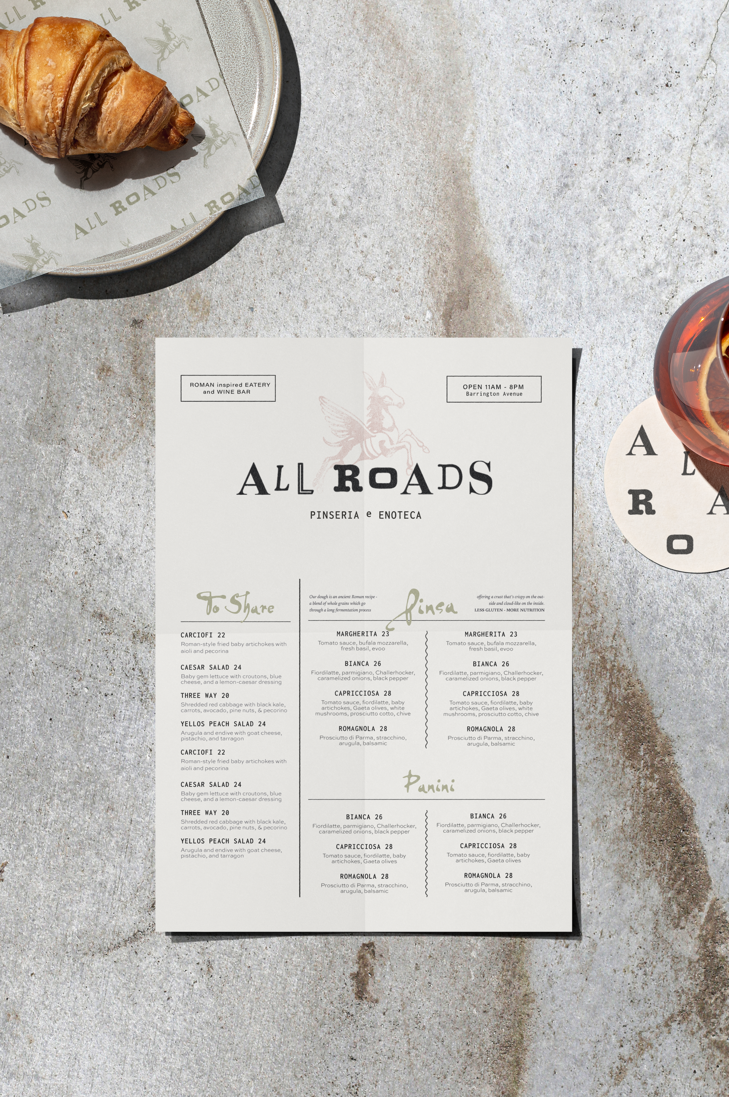
THE MARKS
At the heart of the brand is the Flying Donkey—our fictional muse, affectionately dubbed Holy Mascalzone (Italian for ‘rascal’). He was inspired by a piece of street art tucked into a quiet corner of Rome’s historic center. Strange, scrappy, and oddly moving, the original mural marked the rebirth of a nearly forgotten neighborhood. It felt like a symbol of resistance, imagination, and local pride—and we knew we had to bring him into the fold.
We gave the donkey a risograph treatment—grainy, layered, and a little rough around the edges—blending the texture of ancient frescoes with the punch of street art. He became the soul of the brand: old and new, rooted and rebellious.
From there, we built out a system of supporting marks. A bold lockup of the tagline—Inspired by Tradition, Not Bound by It—drives the ethos home. And the address mark, usually an afterthought, became a flexible stamp used across menus, merch, and signage.
Together, these elements build a visual language that’s textured, versatile, and unmistakably All Roads.

TYPOGRAPHY
The mixed-font wordmark was a nod to the name itself—All Roads. All walks. All styles. It’s a visual reminder that contrast can be cohesive. That things don’t have to match to belong. We pulled from typefaces old and new, refined and a little strange, to create something that feels lived-in, layered, and inclusive by design.


CASE STUDY FOCUS
PACKAGING
The packaging was designed to do more than carry food—it carries the story. With “ALL ROADS” printed on two sides and “TAKE ME TO” on the others, the box becomes a quiet invitation. Take me to All Roads. Or: All Roads take me to… wherever you're headed. Dodger Stadium. Venice Beach. Your best friend’s backyard. It's a brand moment that leaves the restaurant, gets snapped in a photo, and keeps the experience moving.
ENVIRONMENT
Of course the packaging wasn’t left out of the story—it carries the brand’s narrative beyond the restaurant, so the ALL ROADS experience continues with every takeaway. And as a cherry on top, we extended the brand into the world of craft beer with August Notions, a sub-brand inspired by the Roman Stoics.
MESSAGING
We shaped the messaging to feel like the space itself—warm, a little offbeat, and quietly confident. The tagline, “Inspired by Tradition, Not Bound by It,” became a north star. It speaks to the heart of All Roads: rooted in Roman tradition, but not afraid to riff. The Flying Donkey carries that ethos—part history, part rebellion, all in stride.